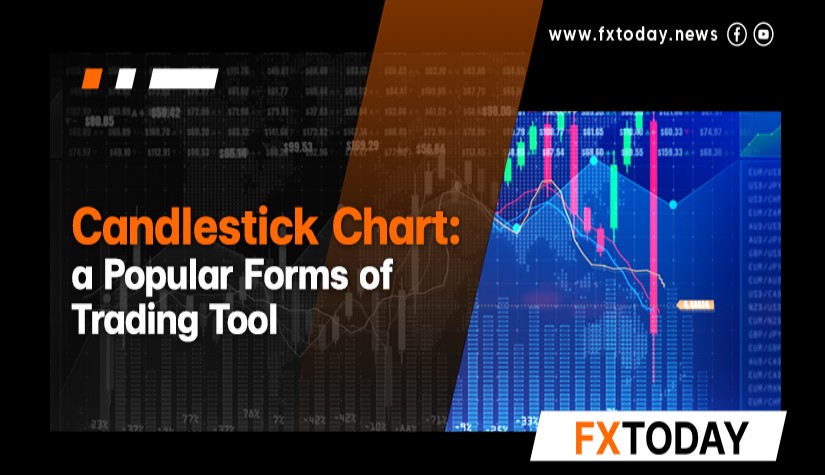
Candlestick charts have been popular with traders all over the world from past to present. It originated from a Japanese merchant who used candlestick charts to see the trend of rice prices and he later became a millionaire. Causing Western investors to use candlestick charts more and more.
In this article, the team will take all traders to get to know more about candlestick charts. Including reading charts to increase the chances of successful trading.
What Are Candlestick Charts?
Candlestick charts are charts resembling candlesticks that illustrate the price movements of various assets.

What Candlestick Chart Shows?
Candlestick charts show how prices move over time. Experienced traders use candlestick patterns to predict future price movements. There are various candlestick patterns.
1. Long lower wicked candlestick
An increase in buying volume during a decreasing asset price is a strong indicator of a reversal in the asset's trend.
2. Long upper wicked candlestick
An increase in selling volume during an increasing asset price is a strong indicator of a reversal in the asset's trend.
3. Full body candlestick
It depends on the color of the candlestick as it comes to a close whether the market tends to be up trend (green candlestick) or down trend (red candlestick).
Even if the examples hold true in many cases, traders should find out more techniques or tools to trade more effectively.

History of Candlestick Chart
The origin of candlestick charts was created and developed in the 18th century by Munehisa Honma, a Japanese rice merchant. Candlestick charts were first used to track market prices and daily momentum before being used widely in the Western world. The information is documented in Steve Nison's book entitled ‘Japanese Candlestick Charting Techniques’.
However, Author Nison claims in his book entitled Beyond Candlesticks that "Honma does not seem to use candlestick charts, according to a search for candlestick charts, they were developed in Japan during the beginning of the Meiji period (late 1800s)."
Therefore, it is hard to deny the fact that candlestick charts are widely used in Forex and other markets nowadays.
Understanding Candlestick Charts
Candlestick charts are rectangular bars with wicks at the bottom and top, similar to a candle. Each candlestick chart displays the high, low, opening, and closing prices of assets over each time period depending on user's settings. The picture shows how to read candlestick charts.

Bullish Candlesticks
If a green candlestick shows an uptrend, the price pattern will be as follows :
- The opening price is the upper border of the body of the candle.
- The closing price is the lower border of the body.
- The highest price is the top of the upper wick.
- The lowest price is the bottom of the lower wick.
Bearish Candlesticks
If a red candlestick shows an downtrend, the price pattern will be as follows :
- The opening price is the lower border of the body.
- The closing price is the upper border of the body of the candle.
- The highest price is the top of the upper wick.
- The lowest price is the bottom of the lower wick.
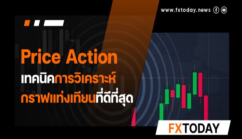
However, the displayed candlestick may take many patterns as the price changes according to the difference in market conditions. The following is a study of candlestick patterns to predict an asset's price movement.
Candlestick Patterns
There are two types of candlestick chart analysis, individual and group charts, that can be used to study price movements, as various patterns lead to different trading outcomes.
This article will provide examples of both of these candlestick chart patterns as follows :
1. Doji Candlestick Pattern

In the image, the closing and opening prices are pretty close, and the upper and lower wicks are both quite long, forming a Doji pattern. This candlestick pattern can appear on either an uptrend or a downtrend chart, or several at the same time.
The appearance of the Doji candlestick will cause a price reversal, based on the supply and demand principle that exists in the market. In the gray circle shows that the price has reversed and the trend has changed.
For the example of the Doji candlestick in a bullish market, when the buying volume starts to decrease, the selling volume will take over. It will cause price fluctuations, which the trading volume will be expressed as a candle filling and then turned down to close the opening.
2. Engulfing Candlestick Pattern
The pattern of engulfing candlesticks is another indicator of a market reversal as follows :

The Engulfing pattern consists of the first candlestick, which can be bullish or bearish. The next candlestick usually has a long wick and must be different colors. The red rectangle shows a downward reversal engulfing the candlestick when the first candlestick has both upper and lower wicks.
Even though the second candle is a bearish one, it also has a top and a bottom wicks. Consider that the back candle must cover the front candle or its low will be lower than the high of the front candle. The candlestick in the back is also larger.
The front candlestick indicates that the prior trend market has slow-moving, and when the price opens high and moves further but comes into contact with selling volume, the price falls abruptly as in the picture. A strong price movement causes an abrupt change in price direction followed by a trend reversal to the previous chart.
3. Hammer Candlestick Pattern
Hammer is a chart pattern indicating a price reversal, where the body is short, but the wick is long relative to the body, as the image below.

The image shows that a hammer candlestick indicates a price reversal. The image shows a bullish-to-bullish reversal with different wick directions. If the candle has a high upper wick, there is buying volume to lengthen it, which means the sell volume wins when the candlestick shrinks.
The second hammer pattern has a shorter reversal because when the hammer pattern is formed, the price bounces back to close at the high point, indicating that there is a lot of buying support. If the market can stand selling volume, the price will have a low fluctuation. Because the hammer candlestick pattern in Figure 2 causes a price increase. Thus, the reversal occurred only after a brief period of time.
4. Hangman Candlestick Pattern
The Hangman candlestick is a similar pattern to the Doji and the Hammer. The Hammer pattern does not have an upper or lower shadow, while the Doji is centered and the upper and lower wicks are similar in size which breaks. Unlike the Hangman candlestick, the Hangman candlestick has two wicks, but one side has a longer wick than the other.

The Hangman candlestick formation produces a reversal just like any other pattern, because the Hangman can also create a reversal just like a Doji. Due to the severe selling volume, the candle filling but still has the power to buy until the price returns, causing the reversal.
Conclusion
These 4 candlestick patterns are all reversal patterns. However, there are many additional patterns on candlestick charts; traders can begin with the ones that are useful for trading. Candlestick charts are not the only way to analyze trends, therefore traders must also utilize other tools. However, we should all agree that experience will improve your trading efficiency.
____________________________________________
Maximize your knowledge: Articles
Keep up to date on global events: News
Explore in-depth analysis: Technical Analysis